The Polar Bear Project
Design Strategy
Logo

The goal of this campaign was to create a brand that would reflect the dangers of polar bear endangerment by using various blues and easy to read text. The feel of this campaign was meant to be friendly and inviting, while also showcasing vital information to young adults who want to make a difference.


Creating the logo for the brand needed to connect to the target audience in a clear and concise way, while also being unique. I designed the logo using Illustrator to create a strong brand identity.
Infographic


Creating a visually interesting and accurate informational piece was the biggest goal for this infographic. Everything was created on Illustrator and it follows the brand strategy guidelines. It was important to me to create visually accurate information to impact the target audience.
Newsletter


Utilizing columns was the biggest challenge of this newsletter. I wanted to created a newsletter that was unique and fun, unlike other typical newsletters. I integrated the text and images to create interesting visuals. The PDF is also interactive so people can submit the form on the last page. This was created on Indesign.
Poster
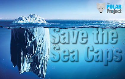
Creating a poster with integrated text to make it appear as if the text was actually there was the idea behind this. This was made on photoshop and Indesign. I really wanted to utilize depth in this design to really hit-home that sea caps are melting at an alarming rate. Polar bear images were getting old, so I used a different technique that still followed the design strategy.
Pictographic
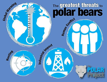
The icons in this design were made in Illustrator, while the overall layout with put together in Indesign. It was difficult creating simplistic icons that represented significant problems in our environment while also being eye-catching and relevant to the target audience.